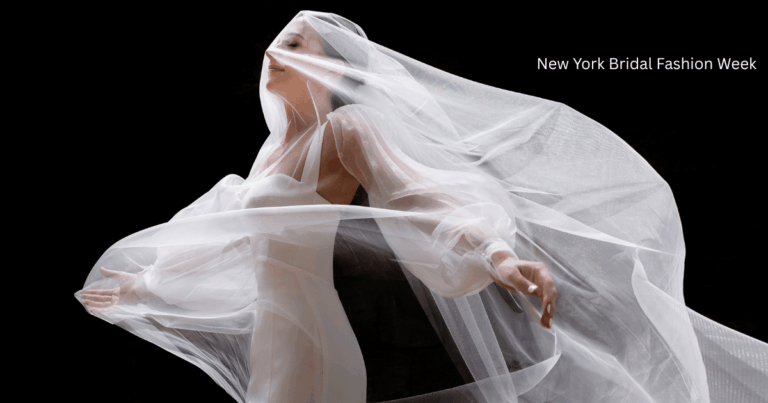
Cheers, bridal babes — and welcome back to Martini Mondays with Chrissy & me!
First things first: thank you for being patient while we got settled. In true Alexandra fashion, I decided to move and start building a new house in about a month and a half (because why not add chaos to my life?). We finally moved in last week, and the best part? Chrissy and I are officially living together for a bit — which means more unfiltered wedding chat is coming your way. Buckle up for the good, the bad, and the totally fabulous.
This week we’re sipping Skinnygirl Cosmopolitans — clear, flirty, and perfect for anyone who wants to keep it light without sacrificing flavor (bonus: no red stains on your carpet or your couch… every mom’s dream). Next time I drink this gem, I’ll have to wear white, just because I can’t around my kids — one spill and game over!
And what better drink to pair with our topic of the day: wedding décor!
(There’s so much to say, we decided this will be a two-parter.)
Start with Your Venue
Your venue sets the tone — not because you need to “match” it exactly, but because certain spaces naturally lean toward certain vibes.
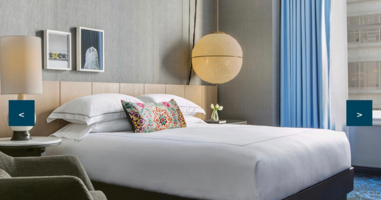
- Booking a glam hotel ballroom? Think metallic accents, luxe florals like orchids, and elegant linens — farmhouse tables just don’t belong there.
- Choosing a raw space or a converted warehouse? The world’s your oyster. You can go moody, modern, fairy-tale garden… whatever fits your style.
- Planning a farm or outdoor wedding? You can absolutely keep it upscale, but let it feel organic and cohesive with the surroundings.
Stylist Tip: I always tell my brides – pick the venue that speaks to you first. Your dress doesn’t have to match it perfectly, but your overall aesthetic should feel intentional.
Define Your Color Story
Before you fall down the Pinterest rabbit hole, decide on:
- A main color (your anchor)
- One or two supporting shades (accents)
- A metallic or neutral (to ground everything)
We chatted about how mismatched palettes can feel chaotic. For example, if your bridesmaids are in black, silver or champagne linens look chic — but pairing black dresses with purple tablecloths? Hard pass.
Sage green + amber accents is huge right now (I just styled a shoot around that palette), and moss green still feels fresh when balanced with golds or taupes. Bottom line: curate colors that complement each other rather than compete.
Make a Statement Moment
I’m a huge believer in a wow factor as guests arrive — a sneak peek before the full reception reveal.
Think:
- An epic escort card display
- A striking floral installation
- Live musicians who match your color palette (like the electric violinists one of my brides had — it was magic)
This “moment” sets the tone and builds anticipation before everyone enters the main space.
Pinterest Is Your Friend (Yes, Really)
Gone are the days of cutting magazines and pinning to cork boards — though Chrissy and I still love a good old-school collage. Pinterest’s collage board tool is a lifesaver: build separate boards if you’re torn between vibes (black & white chic vs. vibrant magenta, for example). It’s also gold for communicating with your planner, florist, or stylist (hi, that’s me!).
Coming Up Next Week…
We’re not done with décor yet. Next week we’ll dive into:
✨ Signage & personal touches
✨ Bar styling (because you know I love a chic cocktail moment)
✨ Cakes — and yes, we’re trying to score some tastings while we chat!
If you’re planning right now, grab a notebook or start that Pinterest board — there’s a lot to think through, but when you layer these details intentionally, the result is breathtaking.
Until part two… cheers + kisses, bridal babes!


Venue: Hilton and Towers, Chicago
Floral & Decor: Kehoe Designs
Photography: Stacy Able